Notifications

13 minutes, 12 seconds
-21 Views 0 Comments 0 Likes 0 Reviews

Typography plays a critical role in communication, and nowhere is this more evident than in restaurant menu design. While food photography and color schemes often get the spotlight, the fonts used on a menu quietly shape the dining experience and influence customer perception. Typography not only makes a menu readable—it sets the tone, reflects the brand, and subtly guides choices. Choosing the right fonts can mean the difference between a menu that invites exploration and one that creates confusion or disinterest.
The Power of First Impressions
Before diners even take a bite, they begin forming opinions based on visual cues. The menu is often the first direct interaction a customer has with a restaurant’s brand. The font choices you make can instantly communicate whether your restaurant is casual or fine dining, modern or traditional, playful or serious. A hand-lettered script might evoke the charm of a cozy café, while sleek sans-serif fonts suggest modern sophistication. The typography on your menu becomes the voice of your restaurant before a server even greets the table.
When considering restaurant menu design, it’s important to recognize the emotional and psychological responses that typography can trigger. People associate fonts with past experiences, cultural cues, and even specific industries. For instance, serif fonts like Times New Roman can feel formal or classic, while whimsical decorative fonts might suggest a more creative or fun environment. Understanding these associations is key to crafting the right impression.
Font Families and What They Say
Every font has a personality. In restaurant menu design, choosing the right font family helps convey your concept and enhances your brand identity. Let’s explore a few common font categories and the stories they tell.
Serif Fonts: These fonts have small lines at the ends of characters and often appear traditional, refined, and trustworthy. They’re excellent for upscale dining establishments, wine bars, or restaurants that want to convey a sense of heritage. Fonts like Garamond, Baskerville, or Georgia work well when you want to create an elegant atmosphere.
Sans-Serif Fonts: These are clean, modern, and versatile. They’re widely used in contemporary restaurant menu design because of their legibility and minimalist appearance. Restaurants with a modern or casual vibe—think fast-casual eateries or health-conscious cafés—often lean toward fonts like Helvetica, Futura, or Open Sans.
Script Fonts: Script fonts emulate handwriting or calligraphy. They’re expressive and can lend a personal or artisanal feel to a menu. However, they should be used sparingly, perhaps in headings or section titles, as they can be hard to read in longer text blocks. These fonts work beautifully in bakeries, boutique restaurants, or themed venues.
Display Fonts: These fonts are distinctive and attention-grabbing. They’re designed to make a statement and can add character and flair to your menu. Use them for the restaurant name or as part of section headers, but pair them with simpler fonts to maintain readability. Display fonts are often seen in themed restaurants or places that want to stand out through visual creativity.
Legibility: A Functional Priority
It’s easy to get carried away with creative fonts, but readability must come first. A beautiful menu is useless if customers struggle to read it. Legibility depends on several factors including font size, spacing, line height, and contrast between text and background. A font that looks amazing in a logo might be completely impractical in a menu format.
As a general guideline, use a font size of at least 10–12 points for body text and slightly larger for headings. Ensure there’s enough white space between lines and sections so that the eyes can easily follow the layout. Avoid using overly condensed or ornate fonts for the main body of your menu. If customers need to squint or tilt their heads to decipher the descriptions, their experience—and your sales—can suffer.
Consistency and Hierarchy
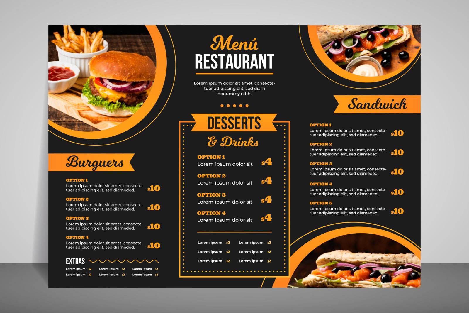
A well-structured menu uses font hierarchy to guide the reader's eye. By varying font sizes, weights, and styles, you can create a visual roadmap that makes your menu easier to navigate. This hierarchy also tells your story in layers, drawing attention to what matters most.
For example, use a bold, slightly larger font for section titles such as “Appetizers” or “Entrées.” Item names can be a medium-weight font, followed by lighter or smaller fonts for descriptions. Prices should be consistent in style and aligned neatly to maintain a clean appearance. When done correctly, the typography directs the flow without overwhelming the reader.
In restaurant menu design, consistency across font choices also supports brand identity. Stick to no more than two or three font styles throughout the menu to avoid visual clutter. Choose a primary font for headings, a secondary font for body text, and optionally a third decorative font for accents. When these fonts complement each other, they form a cohesive narrative that reinforces your restaurant’s character.
Matching Typography with Cuisine and Concept
Your menu’s typography should align with the type of food you serve and the overall dining concept. A rustic farm-to-table restaurant might opt for hand-drawn typefaces or vintage serif fonts to emphasize authenticity. On the other hand, a sushi bar may prefer sleek, geometric sans-serifs that reflect precision and simplicity.
Think about the cultural background of your cuisine as well. An Italian trattoria might use traditional serif fonts with romantic curves, while a Mexican cantina may lean into bold, festive lettering. Matching typography to the food reinforces the authenticity of the experience.
Even within the same genre of cuisine, differences in tone can lead to different typographic choices. A high-end French restaurant and a casual Parisian bistro both serve French food, but their menu fonts should differ to reflect their distinct vibes. One might use an elegant script and refined serif combination, while the other might go for playful, handwritten fonts with casual charm.
Using Typography to Influence Choices
Typography doesn’t just guide readers—it subtly persuades them. Strategic font choices can influence what diners order. Highlighting signature dishes using bold or distinctive fonts can draw attention to higher-margin items. Similarly, italicizing chef’s specials or unique ingredients can spark curiosity and suggest exclusivity.
Color also plays a role when combined with typography. Warm colors like red and orange can increase appetite, while cooler tones like blue suggest freshness and calm. The combination of font style and color can push customers toward certain selections without overtly steering them.
Restaurant menu design is both an art and a science. Using typography to your advantage means understanding how font psychology and layout can shape customer behavior. From a design standpoint, fonts act as a subtle marketing tool that supports your bottom line while enhancing the dining experience.
Digital Menus and Responsive Design
With the rise of digital menus, particularly QR code-based options, typography must now function across different screen sizes and resolutions. What looks good on a printed menu may not translate well to a phone screen. In this context, sans-serif fonts often outperform serif and script fonts due to their clarity at smaller sizes.
Responsive design also requires flexibility in font selection. Choose web-safe fonts that maintain integrity across devices and browsers. Keep headings bold and short for easy scanning, and ensure there’s enough spacing between elements to accommodate touch interactions. A user-friendly digital menu still needs to reflect your brand’s personality, and typography remains central to achieving that goal.
Font Licensing and Practical Considerations
When selecting fonts, consider licensing requirements. Many premium fonts require commercial licenses, especially for widespread use in marketing materials and menus. While there are many free font libraries available, such as Google Fonts, not all offer the uniqueness or refinement that a custom typeface can bring.
Also, keep in mind the practicality of your menu environment. If your printed menus are subject to frequent spills or are laminated for durability, high-contrast fonts will remain readable even under glare or wear. Consider how lighting conditions and paper texture may affect the final appearance of your typography.
Typography as an Extension of Brand Identity
Your menu doesn’t exist in isolation—it should harmonize with your restaurant’s interior design, signage, website, and other customer touchpoints. A cohesive brand identity makes your restaurant more memorable and creates trust. Typography acts as a silent ambassador of that brand.
When every detail—from the logo to the menu to the bill—shares a unified visual language, it tells customers that you care about the experience. This attention to detail encourages loyalty and reinforces your restaurant’s position in the market.
Conclusion: Telling the Right Story Through Type
Typography is more than an aesthetic choice in restaurant menu design. It’s a tool that communicates values, evokes emotion, and influences decision-making. Fonts tell your story just as much as your food does. The right combination of typefaces can turn a simple list of dishes into a memorable part of the dining experience.
Whether you’re designing a menu for a fine dining venue, a food truck, or a neighborhood café, your typography choices should align with your concept, enhance readability, and reflect the essence of your brand. In doing so, you’ll not only guide customers through their meal choices—you’ll also invite them to become part of your story.

